

Test your knowledge :)
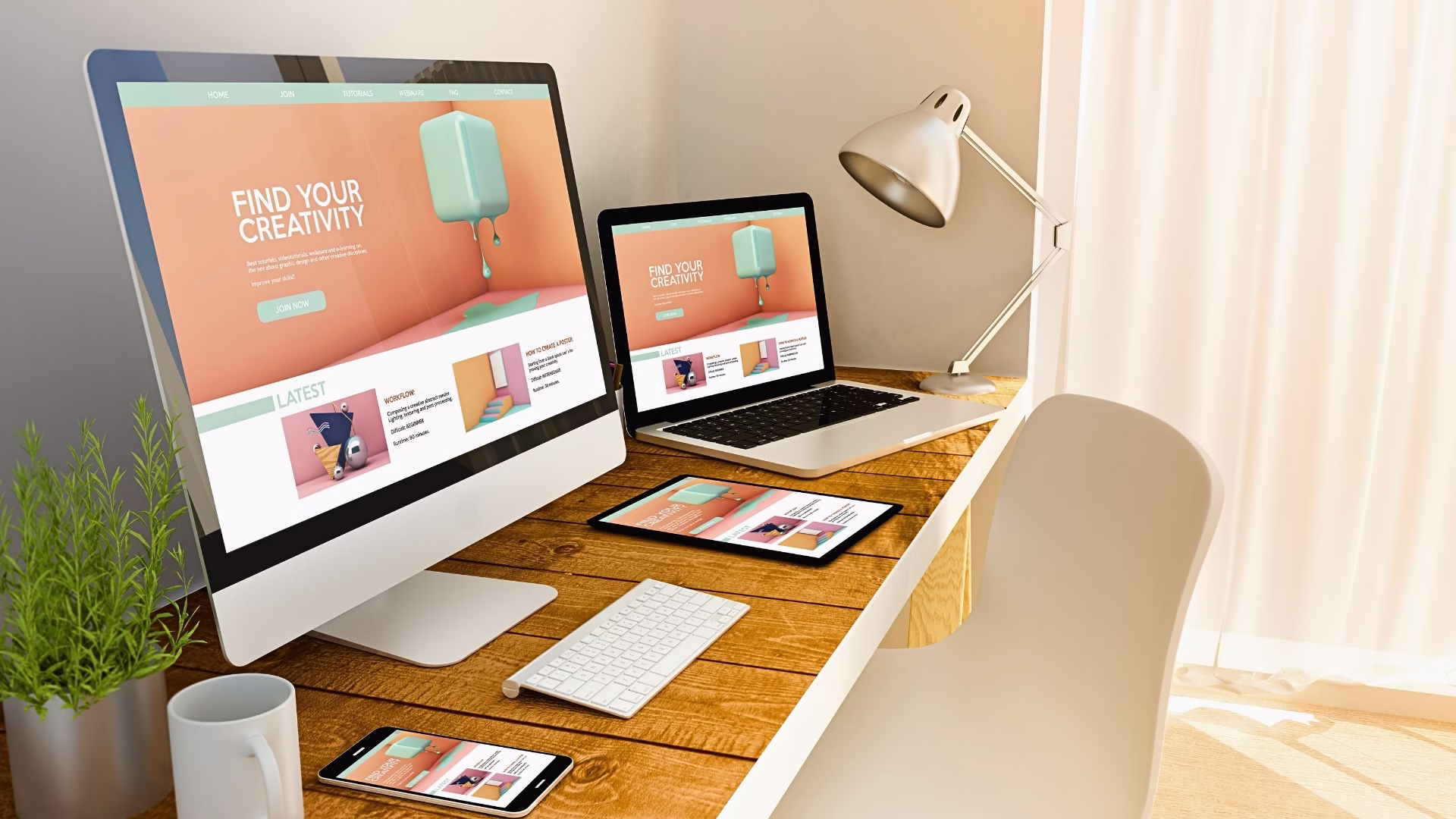
Understanding the Importance of Blog Design in User Experience

Have you ever thought about what makes a blog awesome? It’s all about blog design! Let’s see why it’s a big deal and how it can make your readers thrilled.
In today’s digital world, blogs are where people share their thoughts and stories. But it’s not just what they write; how the blog looks and works matters a lot.
Blog design is like knowing the secrets of making a game fun. When a blog is easy to use and pleasing to the eyes, it attracts readers like magnets. I was experimenting with blog design when I had my previous blog. I was implementing different colors and fonts. Then, I was checking how readers behave over time, what they like, and what they don’t like. I learned a lot. This experience helped me to create Simplitty.
Related: Learn how to start a blog.
A great blog isn’t just a beauty; it’s also your friendly guide. It uses colors, fonts, and where it puts images to create an adventure for you. And it’s easy to navigate, like a treasure map. It took me a while to learn it. Nowadays, we have many online resources and courses, which helped me a lot. My online research took time, but now I know how to design the webpage. Taking marketing courses, I learned the psychological aspects related to readers’ behaviors. Now you can learn it too.
When a blog is user-friendly, you can find what you want without getting lost. Clear menus, search bars, and sorted categories make exploring a breeze.
Blog design isn’t just about looking good; it’s about how it feels. A messy blog is like meeting a disorganized friend – frustrating, right? But a well-designed blog is like meeting an organized, friendly one. Readers trust it and want to stay.
Remember, excellent blog design connects with your audience. It’s all about using tricks from website psychology to create a spot readers love. Next, we’ll dive into what makes a blog design tick. I’ll share with you what I learned about website design at the university and during online courses. I’ll also tell you how the psychology of colors in branding and web design works. It’s the knowledge that all web designers should know and apply to their projects. Keep reading!
The Role of Color Psychology in Blog Design

Have you ever noticed that the colors on a website make you feel a certain way? That’s because color psychology is at play in blog design! It’s like a secret language of colors that can make your web more appealing to readers.
Each color has its own superpower for making people feel stuff. For example, warm colors like red and orange bring energy and excitement. On the flip side, cool colors like blue and green are all about making you feel calm and relaxed. So, picking the right colors for your web design is like creating a mood that matches your content.
But here’s the thing: choosing the perfect colors isn’t just a random game. It depends on your readers, what you’re talking about, and what you want to say. Let’s say you’re running a wellness blog that’s all about chilling out and finding your zen. In that case, soft blues or gentle greens might be better than fiery reds or bright yellows.
Did you know?
1. Statistics show that 93% of all shoppers declare that they focus on the product’s visual appearance when they think of buying it or not.
2. Research presented by HubSpot shows that different colors have different effects on subjective experience, and color psychology can influence 85% of customers’ purchasing decisions.
And it’s not just about single colors; it’s also about how they team up. Think of it like putting together a great outfit. Combining colors that go together well can make your blog look great and easy to read. If you know a bit about color theory, you can use tricks like complementary or analogous color schemes to make your blog look even more incredible.
So, using color psychology in your website design is like adding a splash of magic. It helps you convey your message and catch your readers’ eye at the same time. It can help to improve the conversion rates. Adding design elements, you must think it through to avoid mistakes. It’s not easy to create a visually appealing web page. Colors and visual elements will help you stand out.
The Impact of Typography on User Engagement and Readability

You know what’s cool? Typography. It’s like magic for your blog, making it super easy to read and keeping readers hooked. Let’s dive into how fonts, spacing, and the way words look can make your blog amazing.
First things first, you want your words to be friends with your readers’ eyes. So, choose fonts that are easy on the eyes. Use fonts with clear letters and just the right amount of space between them. This makes reading a breeze and keeps your readers smiling. Typography can improve user’s engagement on your website. It can also make a call to action (CTA) stand out more.
To make your blog even better, here are some tips:
- Choose fonts wisely: Pick fonts that match your blog’s style. You can mix it up with fancy ones and simple ones to keep things interesting while still being easy to read.
- Font size matters: Don’t make your words too tiny. Big letters are a win because small text can give your readers eye strain, and that’s no fun.
- Pay attention to line spacing: Imagine your words are like friends at a party. You don’t want them too close that they’re bumping into each other, but you don’t want them so far apart that they feel lonely. Good spacing makes your blog comfy to read.
- Use hierarchy: Use different fonts, sizes, or styles for headings, subheadings, and regular text. It’s like giving your readers a map to explore your blog without getting lost.
- Contrast is key: Make sure your words stand out from the background. You wouldn’t want to read a book in the dark, right? So, keep it easy on the eyes with a good color contrast.
By following these typography tips, you’ll turn your blog into a cozy reading corner. Your readers will love it, stay longer, and gobble up all your fantastic content. It’s like making your blog a best friend for your readers.
Did you know?
As per experts from Toptal.com: Designers can use data visualization psychology to help viewers absorb more information faster and with less effort, as it lightens conscious processing and decreases memory load.
User-Friendly Navigation and Information Architecture

Let’s chat about something super important for websites: making them easy to use! We’re talking about user-friendly navigation and how it helps folks like you find stuff quickly and without any fuss.
So, user-friendly navigation is all about making it a piece of cake for you to go through a website. It’s like having clear and simple menus, buttons, and labels that tell you where everything is. When a website is easy to get around, you’re more likely to stay and find what you’re after.
Now, the way a website is structured and organized is like the secret sauce. It’s about putting similar stuff together, like having all the games in one place and all the videos in another. Everything has its special spot, and it’s easy to know where to look.
And here’s the cool part: those menus and categories are like your tour guides. They show you the way around the website. Menus are like signs, big and clear, telling you where to go. Categories are like labels on boxes, giving you a sneak peek of what’s inside.
So, in a nutshell, making a website user-friendly is a must. When menus make sense, things are organized nicely, and it’s easy to explore, it’s like having a fun adventure. Visitors enjoy it, stick around, and want to come back for more. It’s like making your website a friendly playground for everyone!
The Use of Visual Hierarchy to Guide Users’ Attention

Okay, picture this: you’re on a website or using an app, and it just feels right. That’s the magic of visual hierarchy! It’s like a behind-the-scenes trick that designers use to guide your eyes and make your experience awesome.
So, what’s this magic all about? It’s about making things stand out. Like, when you see something big on a page, you can’t help but notice it, right? And when colors pop, they’re like flashing signs saying, “Hey, look here!” Designers use these tricks to create a roadmap for your eyes. It’s like they’re leading you on a journey from the homepage through the content.
But there’s more to it. Pictures and how things are placed also join the party. The right picture can be like a superstar, stealing the spotlight and making you say, “Wow!” And when stuff is lined up in a smart way, it’s like they’re saying, “Check this out first!”
When designers work their magic with visual hierarchy, it’s like they’re giving you a tour. You’re more likely to hang around because you’re not lost in a sea of info. It’s like turning a regular book into a pop-up adventure. So, visual hierarchy is like a secret weapon for designers. They use it to make sure you see the good stuff and have a blast exploring.
Incorporating White Space for a Clean and Balanced Design

Have you ever heard of white space in blog design? It’s not about color, it’s about the empty areas on a page, like the gaps between text, pictures, and other stuff. And guess what? It’s a game-changer when it comes to making blogs look clean and easy to read.
So, why is it so awesome? Well, first off, white space gives your words some breathing room, like letting them stretch and relax. This means you can read without feeling like you’re in a maze. It’s like a peaceful oasis in the middle of a bustling city.
But there’s more! White space is like a spotlight that shines on the important things. It says, “Hey, look at this!” So, if there’s something super vital, like a big message or a button to click, white space makes sure you don’t miss it.
And that’s not all. White space also makes a blog look neat and tidy, like a well-organized room. Everything has its place, and there’s a nice balance. It’s like when you tidy up your room and it looks all spick and span. A well-arranged blog isn’t just easy to explore; it also looks professional and trustworthy.
So, white space is like a secret design tool that makes blogs comfy to read, highlights the important stuff, and gives the whole page a polished, professional look. Designers love using it to create blogs that are not just easy on the eyes but also super inviting for readers.
Did you know?
Experts from clx.com say that customer research, data-driven insights, and web psychology principles should dictate the design of a website, not the designer’s biased perspective.
The Influence of Images and Visuals on Emotional Engagement

In our fast-paced digital world, where our attention span is shorter than a sneeze, images and visuals in blogs are like the superheroes of the internet. They not only make a blog look awesome but also keep us hooked and feeling all the feels. This includes a logo design for your web. Visual elements are part of the first impression.
One big reason why images and visuals are such a big deal is because they stir up emotions. Studies have shown that looking at pictures or graphics can make us feel stuff. It’s like a rollercoaster of emotions – happiness, surprise, curiosity, or even empathy. So, when you see a cool photo, an eye-catching chart, or an engaging video, it’s like your heart saying, “Wow!”
But here’s the secret sauce: when you pick images for your blog, they need to match your message. It’s like putting the right puzzle piece in the right spot. Choosing images that relate to what you’re talking about can make your message stronger and help your readers connect with your words. And if you pick visuals that your readers will love, it’s like you’re speaking their language and getting them all excited.
Now, here’s the kicker – while images are like rock stars in capturing attention and feelings, they work even better when they team up with well-written words. It’s like a delicious combo where words and pictures work together to tell an awesome story that captures your readers’ hearts and minds.
So, to sum it up, using images that fit your message and tug at your readers’ heartstrings is like blog design magic. It makes your readers feel at home, and they can’t get enough of your fantastic content. Images and words together? That’s the winning recipe for a blog that rocks!
Creating an Emotional Connection through Branding Elements

Creating a special bond with your audience is like making a new friend. And one fantastic way to do this is by using branding elements in your blog design. These elements are like your blog’s signature style, and they include things like logos, colors, fonts, and other visual stuff that you use consistently for your brand.
First up, we’ve got logos. They’re like the face of your brand, and they’re super important for people to recognize and remember you. A well-designed logo can make people feel things, and it should show what your brand is all about and click with your target audience. It’s like saying, “Hey, this is who we are.”
Now, let’s talk colors. Colors have magical powers to make you feel stuff. For example, red and orange can make you feel all excited, while blue and green can make you feel calm and trusting. By using these colors in all your brand stuff, you’re telling people how to feel about your brand. It’s like speaking to their hearts through colors.
But here’s the secret sauce – being consistent with these branding elements is the key. Whether it’s your logo, colors, fonts, or visuals, using the same style everywhere – on your website, social media, and marketing stuff – makes your brand feel like a cozy, familiar place. And when people know what to expect, it’s like building a trusty friendship. It’s easier for them to connect with your brand on an emotional level.
In a nutshell, by smartly using branding elements like logos and colors and keeping a consistent style in your blog design, you’re creating a special emotional connection with your audience. This connection isn’t just about your brand; it’s like making lifelong friends who connect with the feelings these elements evoke. It’s pure branding magic!
Crafting a Blog That Speaks to Your Readers – Practical Tips for an Awesome User Experience

Hey there, fellow blog enthusiasts! Have you ever wondered how to make your blog not just visually appealing but also super user-friendly? Well, let’s chat about two cool concepts – Hick’s Law and Gestalt Principles – and see how they can turn your blog into a user experience wonderland!
1. Hick’s Law: Making Choices Less Stressful
So, Hick’s Law is like the MVP of reducing decision-making stress. Imagine this: your blog homepage resembles a carnival with too many rides. Not cool, right? Let’s simplify. Cut down on menu options, keep things organized, and guide your readers to the good stuff.
Easy Tips:
- Trim down menu options. Less confusion, more clarity.
- Highlight what matters most. Prioritize your content like a pro.
- Nail those calls-to-action (CTAs). Clear and snappy – that’s the secret sauce.
2. Gestalt Principles: Making Your Blog a Visual Treat
Now, Gestalt Principles are the artists of the blog world. They’re all about making everything look like they belong together. Say goodbye to disjointed images and text – we want harmony!
Real Talk Tips:
- Group things that go together. Proximity is your design BFF.
- Keep the visual flow going. No one likes a bumpy ride.
- Connect the dots visually. Closure is the magic trick.
3. Color Psychology: Setting the Mood
Colors speak louder than words, right? Let’s talk about emotions. Warm tones like red and orange bring the party, while cool blues and greens chill things out.
Practical Hues Tips:
- Match your colors to your blog vibe. Are you cool and calm or bold and lively?
- Make key elements pop. Contrast is your design superhero.
- Test your colors. Make sure everyone can see the awesomeness.
So, there you have it – turn your blog into a user-friendly haven by bringing these concepts to life. It’s not just about making it look pretty; it’s about making your readers feel at home. Happy blogging, you design maestro!

Emerging trends or future developments in blog design

As we approach 2025, the blogging world is set to undergo some exciting changes. Emerging trends and future developments in blog design will shape how bloggers create and share content. Here are some of the trends that we can expect to see in the coming year:
- Cross-channel promotion: One of the dominant blogging trends in 2024 was cross-channel promotion, which integrated all marketing channels and unified their plans, data, and goals across the board. This trend is likely to continue in 2025 as bloggers seek to reach a wider audience and increase their traffic and conversions.
- Visual content: Visual content is on the rise, and it is likely to continue to be a crucial element of blogging in 2025. Using images, videos, graphics, and infographics in your blog post will help you engage your audience, increase retention times, and meet all audience tastes.
- Interactive content: Interactive content is another trend that is set to dominate the world of blogging in 2025. Scrolling animations, micro-interactions, micro-animations, dynamic cursors, and interactive 3D models and content are some of the features that bloggers can incorporate into their websites to make them more engaging and immersive.
- AI-driven personalization: Artificial intelligence (AI) is set to play an increasingly important role in the future of blogging. AI-driven personalization will enable bloggers to create content tailored to their audience’s needs and preferences, thereby increasing engagement and retention.
- Mobile-first design: With more and more people accessing the internet on their mobile devices, mobile-first design is set to become a crucial element of blogging in 2025. Bloggers will need to ensure that their websites are optimized for mobile devices, with fast loading times, user-friendly navigation, and responsive design.
In conclusion, emerging trends and future developments in blog design are set to shape the world of blogging in 2025. By incorporating these trends into their websites, bloggers can create content that is engaging, immersive, and tailored to the needs and preferences of their audience.
Conclusion: Applying Psychological Principles to Create a User-Friendly Blog Design

So, let’s wrap it up and talk about why using the psychology of web design is a game-changer. It’s all about making your blog a comfy place for your readers and keeping them coming back for more.
First off, you’ve got to make your blog easy to read. That means picking fonts that don’t give people a headache and making sure the text is just the right size. Break it up with headings, subheadings, and bullet points so it’s not a big wall of words. That way, readers can quickly scan through and find what they need.
Now, let’s talk about guiding your readers. It’s like being a tour guide in a cool museum. Use tricks like placing important stuff where people can’t miss it, like headers, images, or buttons that say, “Click me!” That way, you’re leading your readers through your content. You can also improve a conversion.
Colors are another cool tool in your design kit. Different colors can make people feel all sorts of things. So, choose the right colors that match your blog’s vibe and don’t make the text hard to read.
So, when you put all these psychology tricks into your blog design, it’s like rolling out the welcome mat for your readers. It’s comfy, easy to explore, and it makes them want to stay and read more. Your blog becomes a friendly place where readers enjoy hanging out. You can apply the same rules to newsletter design. That’s the magic of using psychology in your blog design!
FAQ
What is the role of psychology in user experience design?
Psychology plays a crucial role in user experience (UX) design. It helps designers understand how people think, perceive, and interact with products and services. By applying psychological principles, such as cognitive load theory and information processing, designers can create user-friendly interfaces and intuitive interactions that meet users’ needs and preferences, ultimately enhancing the overall user experience.
What creates a good user experience?
A good user experience is created by having a well-designed and intuitive interface that is easy to navigate. It is also important to provide relevant and helpful content, as well as responsive and efficient performance. Ultimately, understanding the user’s needs and preferences and catering to them is key to creating a good user experience.
What is user experience psychology?
User experience psychology is the study of how people perceive and interact with technology and digital products. It aims to understand user behavior, emotions, and preferences to design more intuitive and enjoyable user experiences. By analyzing user needs and incorporating psychological principles, designers can create products that effectively meet user expectations and enhance user satisfaction.
What are psychologists involved in designing comfortable and user-friendly products called?
Psychologists involved in designing comfortable and user-friendly products are called human factors psychologists. They apply their knowledge of human behavior and cognition to understand how people interact with products and environments. They aim to create designs that enhance usability, satisfaction, and overall user experience by considering factors such as ergonomics, accessibility, and visual aesthetics.
How do you create a good user experience design?
Creating a good user experience design involves understanding the needs and preferences of the target audience. It requires conducting user research, creating intuitive and user-friendly interfaces, and continually testing and iterating the design based on user feedback. A good user experience design also takes into consideration the visual aesthetics, ease of navigation, and the overall functionality of the product or service.
What are psychology principles for web design?
The psychology principles for web design involve understanding how users perceive and interact with websites. Factors such as visual hierarchy, color psychology, and typography can influence user behavior and engagement. User-centered design and usability testing can help ensure a positive user experience by aligning the website’s design with users’ cognitive processes and preferences.
Book Your Trip with These Resources
Here are my go-to resources for planning a seamless and stress-free trip. I personally use these services and highly recommend them.
Flights and Transportation
- Skyscanner – Best for finding cheap flights worldwide.
- Kayak – Ideal for comparing multiple travel sites at once.
- Rome2Rio – A fantastic tool for planning multi-modal transportation routes.
Accommodation
- Booking.com – Best rates for hotels and guesthouses.
- Agoda – Best rates for hotels.
- Hostelworld – Perfect for budget travelers and solo adventurers.
- Airbnb – Great for unique stays and long-term rentals.
- HotelTonight – Awesome for last-minute hotel deals.
Travel Insurance
- SafetyWing – Comprehensive coverage for all travelers.
Trip Planning and Activities
- Get Your Guide – Find tours, skip-the-line tickets, and local experiences.
- Klook – Book tours, tickets, and activities at your destination.
Helpful Tools
- Google Translate – Break language barriers while traveling.
- SurfShark VPN – Stay safely connected wherever you go.
Don’t Forget to Read
Affiliate Disclosure: Some links above are affiliate links, meaning I earn a small commission if you purchase through them at no extra cost to you. These help me keep the blog running, so thank you for your support!


 15")
 16")


